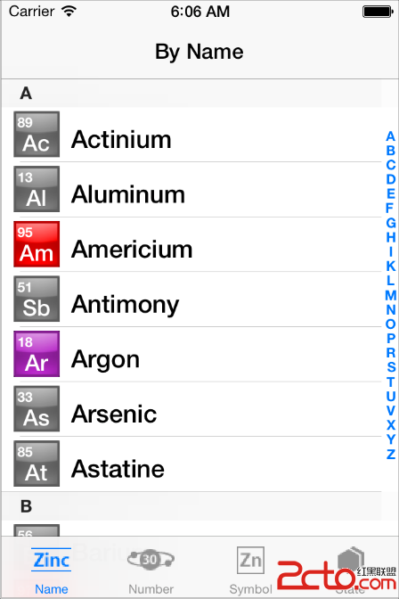
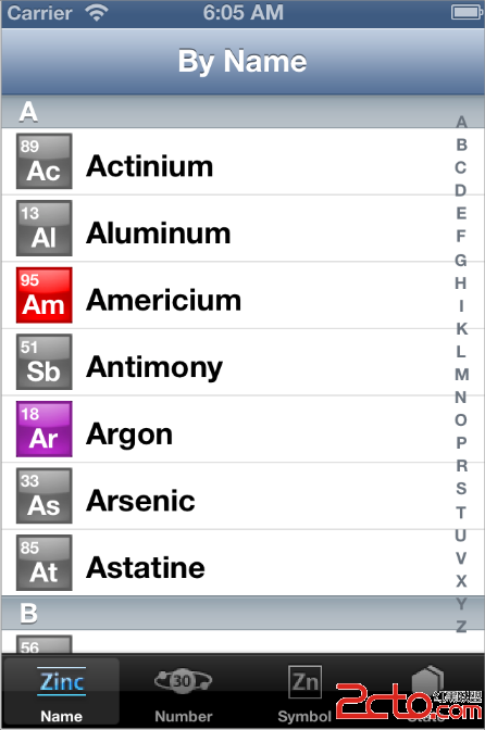
iOS 7 introduces many UI changes, such as borderless buttons, translucent bars, and full-screen layout for view controllers. Using Xcode 5, you can build a project for iOS 7 and run it in iOS 7 Simulator to get a first glimpse of the way the app looks with iOS 7 UI.
For example, the only differences between the two versions of TheElements sample project shown below are the deployment target and the simulator.
TheElements sample app in iOS 7 Simulator

TheElements sample app in iOS 6 Simulator

It’s tempting to dive straight into the work of updating your app, but there are a few things to think about before beginning the process.
As you interact with the built-in apps, it becomes clear that the changes in iOS 7 are both subtle and profound. Familiar UI elements are easily recognizable but look very different. Visual touches of physicality and realism are muted and refined, while realism in motion is enhanced.
NOTE
Although all UI elements look different in iOS 7—and many support new functionality—the UIKit APIs you’re familiar with remain mostly the same.
As you continue to explore, you begin to discern the main themes of iOS 7:
Deference. The UI helps users understand and interact with the content, but never competes with it.
Clarity. Text is legible at every size, icons are precise and lucid, adornments are subtle and appropriate, and a sharpened focus on functionality motivates the design.
Depth. Visual layers and realistic motion heighten users’ delight and understanding.
By bringing fundamental and pervasive changes to the iOS experience, iOS 7 provides a rare opportunity to revisit the way apps communicate their core purpose and functionality to users. Although you might not be prepared to take full advantage of this opportunity today, keep it in mind as you update your app to run in iOS 7. (If you are ready to revisit your app design—or you’re beginning a new project—read Designing for iOS 7 in iOS Human Interface Guidelines for some guidance.)